HOUSEKEEPING
by Richard White
2011-07-29
It’s Housekeeping Day on the website.
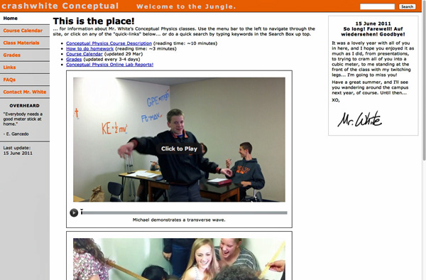
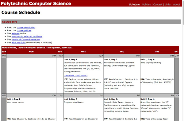
Like a lot of teachers, I have a website associated with each one of my classes, and over the course of a year, that website can get a little messy. Here’s the calendar that I used in the Fall, and there’s the results of that mid-year teacher/text/course evaluation that I posted (I’m a big believer in transparency). Here’s a picture of the class from the beginning of the year, and there’s a video of all of my students trying to squeeze into one cubic meter of volume (they didn’t make it, but it sure was fun trying).
I’ve got to clean all that stuff out and get things ready for the new school year.
There’s something else that I often do at this time of year, depending as always on time constraints. I was listening to website designer Paul Boag talk at one point about managing sites, and he said something that I thought was quite profound: “Many websites have someone responsible for adding new content to the site… but who’s responsible for taking away old content?”
Not all old content should be removed, of course, particularly if one of the site’s functions is to act as a repository of accumulated knowledge. But this isn’t necessary for the vast majority of sites, and certainly not for my class websites. This year’s students don’t want to be greeted with a photo of last year’s class when they log on, and the materials that I used last year may be markedly different from what I use this year.
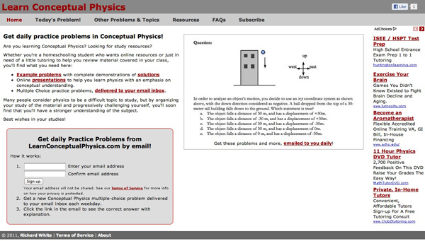
So it’s time to do a little cleaning, and a little pruning. (Below, see the homepage screencaps for three websites that I maintain for different groups of students I work with.)
It may even be the case that you want to look again at the design of your site. Ten years ago I was very pleased with what I felt was the optimal design of my site, until I spent an hour waiting in line at the movies with my friend Aaron doing usability studies with a pile of index cards that I’d prepared specially for the occasion. By the time we were admitted into the theater, I had a completely new perspective on how my site was viewed by someone woho wasn’t me, and the result was an enormous improvement in usability, as indicated by my students in subsequent interviews.
Switching between horizontal and vertical orientations on navigation menus can make a website feel completely different. Moving “Terms of Service” from a prominent location at the top to the barely noticeable footer at the bottom of the page is almost certainly a good idea. Switch from a fixed-width content area to a liquid layout (that resizes with the browser window)? Change themes? Colors? Rollovers? Remove graphics to make the page load faster? Add graphics to increase visual interest? Add a version of your website customized for an iPhone/Android experience, or at least make your website look okay on a mobile screen?
The possibilities for tweaking are endless, which is what makes designing for the web so fun, and so challenging.
I’m not sure I’m going to redesign my website today—that process typically takes a few days, and lots of chatting with people to find out what they like and don’t like. Today, I think I’ll just clean out the old content. That’ll take an hour or two all by itself.
August is almost here—is it time to start thinking about school yet?! ;)


