Gettin’ all Responsive
Richard White
2015-08-26
One of my projects this past summer was to convert most of the websites that I have to a *responsive* design: a single HTML file, with it’s accompanying CSS, will format the content of the webpage in a manner befitting the dimensions of the browser window that’s viewing it.
The browser window dimensions are part of the story, but the real reason you want to do this is to accommodate the different types of devices that people are using to view your site on. Increasingly, tablets and phones are responsible for a surprising amount of web traffic, and the responsible web designer wants to satisfy those visitor with content that is easy to view.
Is this a thing?
How much traffic is mobile-based? Well, here are the results published by Jon Gruber of Daring Fireball for visitors to his own site.
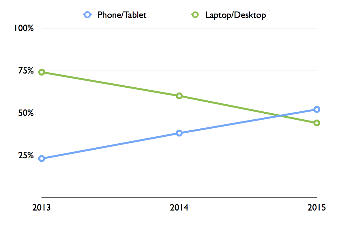
For my own LearnAPphysics.com, 68% of my visitors still come in using a desktop browser of sorts, but that means almost a third of them are using a tablet or phone of some sort. It’s in my interest to make their experience a good one.
How do you make a site responsive?
The technical solution to making a website responsive is simply to include some additional code in a CSS file that describes how different `div`s on the site should behave under different conditions. Perhaps the `header` div will be left-justified on the wide screen of a desktop browser window, but that same `div` will be centered in the smaller width of a cellphone screen. A graphic that fits nicely onto the landscape view of a desktop might not appear at all in the cellphone version of that same window. All of these options are defined by the CSS file.
How do you design a responsive website?
Well that’s the real trick, isn’t it? This HybridClassroom.com website uses a WordPress template that I’ve selected, and there’s a simple interface that allows one to enter text in, and that text then is populated in the fields of the template. I don’t have to do much work beyond writing the text itself.
But the template itself isn’t responsive. WordPress almost certainly *makes* a responsive template that I could use for this site, but I haven’t yet found it and installed it here. Maybe I’ll do that after I get done writing this blog post. ;)
If you’re “rolling your own” website—highly recommended if you have any inclination at all—then you have the power to design your site however you wish, and you already know that design is an incredibly deep and complex topic. But maybe you’ve been doing that, and you’re ready to jump into trying to adapt your design so that it will work on a mobile device?
You could, but it’s far easier to follow Google’s advice and create a new webpage from scratch, in a “mobile-first” vertical design that leverages a smartphone’s portrait mode. Once you’ve done that, you can rearrange the pieces to fit a more standard landscape desktop browser model.
That’s exactly what I ended up doing with most of my websites, and I’ve been very pleased with the results. You can check out the work at LearnAPphysics.com or crashwhite.com/apcompsci. Load either site up in your desktop browser and try resizing the window until it is as small as it will go. You can also visit the sites on a smartphone and compare what you see there with what you see on your desktop machine.
Welcome back for another school year! And now, I’m off to find a responsive template for this website!